| x-species | | |
it's ME
modified by x-species |
| Freakling | | |
| Symmetry on the left side is off. Basically everything there should be farther to the south. |
| LasTCursE | | |
If he moves the left side down it will become more unsymetrical i think
modified by LasTCursE |
| Freakling | | |
He'd also have to move the southern parts a bit counterclockwise...
And he needs better ovi spots |
| LasTCursE | | |
| i find the simetry being okay |
| JungleTerrain | | |
| Map seems tight, there is no large middle area, and once someone takes the highground expos (which will only be taken lategame) that path becomes unuseable for the other player. I recommend making the middle a bit larger, probably making the bridges wider. |
| LasTCursE | | |
i felt the same way when i tested it..
i guees we have a few options here
1) Remove the midle bridges
2) Make them wider by a few hex
3) To make the high ground expo have bigger ramps
3a) towards middle
3b) towards 3rd
3c) both
modified by LasTCursE
modified by LasTCursE |
| sTY_leZerg-eX | | |
Love 3 player maps!!!
And I like option 3 :) |
| Freakling | | |
| I think you should just work on the more blatant symmetry problems and you will win a lot of space for the middle that is now wasted space, mostly in the SW corner. I added some GMCS to indicate the general direction you should go for. |
| Freakling | | |
Also mark the similarity between your nat - low ground expo setup and the highground plateaus on (3)Aztec with the nats and 3rds on them. Look how differently those are shaped in Aztec to use the space better and how similarly they are in your map (I don't say copy it, that wouldn't work anyway, just use them as an example how to break "simple" symmetry to achieve better use of space and overall better symmetry).
Also - you need ovi spots. |
| LasTCursE | | |
i did move the south side up cuz of the symetry if it's pushed down the 3rd get's bellow the ramp which is not symetrical to the other 2 3rd's or i cuodl use a 45 degree ramp which is extremly ugly lol
Also if i push the middle west the nat to middle bridge distance get's extremly more smaller than the other 2 positions and you don't have a little battlefield infront to defend nat from a push..
and correct me if i'm wrong but dosen't (3)actek have even more wasted space than this map? even the SW corner has the same hole it's just the concept :) i thought about putting an island there but it would be kinda bad for blue in that case so i decided to leave it as it is
I do agree about the ovi spots but i don't see where to put em any ideas about that?
More votes for the options by anyone or new idea would be appriciated :))
EDIT:Added few replays!
modified by LasTCursE
modified by LasTCursE |
| Freakling | | |
Just make the strip between W nat and low ground expo straighter than the other ones... YOu can also move and compress the southern parts a bit counterclockwise to gain more room... Believ me, it's doable. Things like ramp positions/ widths can be adapted at all positions if neccessary.
Ovi spots are definitely needed behind the nats and/or at the nat entrance.
If you really want a strinling reason while the current layout is not only optically asymmetric but in fact positionally heavily imbalanced: at south and east posion the nat choke can be defended from the mains (especially by tanks), at western position that is absolutely out of question... |
| LasTCursE | | |
well if it's behind the nat you can put an ovi there and terran can't shoot it with marines
and yeah i'm aware of the problem.. but i don't see how moving everything down would change the tank covarage on the nat choke in any way?
perchaps you can download it and make a rough example of how to make it more symetrical and will see from there?
What are your thoughts on the middle posibilities?
modified by LasTCursE |
| Freakling | | |
| I'll have thoughts about the middle once the overall layout is done. |
| x-species | | |
| i still think this map it's mine |
| LasTCursE | | |
| ������� ����� �� iccup �� ������� �� ���� :� � �� �� ������ �� ��� �� ��� �� �������� � ��� �� �������� "���.. ��� �� �� ��.." :D:D:D |
| LasTCursE | | |
Wider middle birdges + smaller nat one
or
Wider nat bridge + smaller middle ones (current version)
or
Wider middle birdges + Wider middle ramps + smaller nat one ?
modified by LasTCursE |
| x-species | | |
;d emi taka e nie sme edinstvenite tapaci deto pravim mapove ama az sprqx to mi pisna ama tiq nemogat o6te da razberat 4e ne pravq ve4e ...
|
| ProTosS4EveR | | |
| ve4e? i believe you mean p4e |
| LasTCursE | | |
| ve4e means Already in bulgarian |
| JungleTerrain | | |
| lastcurse and x-species are bulgarian? |
| LasTCursE | | |
EDIT:
-New Name
-New picture with a DeadSpace type of banner
-Some minor deco fixes
-Wider middle
modified by LasTCursE |
| Freakling | | |
-new sttuff
-same old problems |
| LasTCursE | | |
Pro maps aren't perfect either in actek down right spot can tank the outer ramp not only the nat choke like the other 2 locations..
in pathfinder you can tank the left player's main ramp from the lowground while you can't in the other 2
It's hard to make everything exactly the same if the map is for more than 2 players..
i told you to make a rough idea of how you see it to be better.. |
| JungleTerrain | | |
I think you should do this (after you make symmetry better, if you are going to):
Here is the same, except middle with no bridges:
I added Overlord spots, changed Red's main/nat area a bit, made nats easier to muta harass, and changed 3 o clock's positioning a bit.
I noticed the ramp going up to the hill at around 9 o clock by the third gas is different size than the its counterparts (1 ISOM tile bigger).
Just some thoughts I guess. |
| LasTCursE | | |
have you looked at the current version i uploaded it has the bigger bridges in there :P and btw something i noticed is that vertical bridges are actualy bigger than the normal ones altho they look smaller
Can you upload the first version as the melee map
Map id 4431
password 1542
And btw what did you use to make the picture
modified by LasTCursE |
| Freakling | | |
| I already gave you GMCs. Don't ask me to make your maps for you. |
| LasTCursE | | |
Moving it down dosen't solve shit except for making it worse cuz expo will get tankable by cliff nat to bridge distance will get way shorter the main still wouldn't be able to shoot at nat choke..
and i was talking to Jungle for his version with the ovi spots ;P |
| Freakling | | |
| YOu're thinking to limited... Just moving around one expo or some would not work out, of course... You'd need to tweak things everywhere. |
| LasTCursE | | |
Or just tweak main+nat like jungle did and make that choke tankable as well?
modified by LasTCursE |
| Freakling | | |
| Main shapes are among the most flexible things when it comes to balancing tweaks. But that alone does not fix all the issues. |
| LasTCursE | | |
| what other issues does the symetry have? everyone has same distance nat to bridge same middle same front of nat+3rd area and same 4th? |
| JungleTerrain | | |
Dude, just do it yourself. All those edits took like 10 mins max.
Just notice what I changed to the mains and nat chokes, especially at 10 o clock.
The pictures I put up were just a rough suggestion of what you should do to the map to help the natural expo area since it currently sucks. I was expecting you to make the symmetry better, if possible.
I also removed a lot of decoration, so that would be more work for you.
modified by JungleTerrain |
| LasTCursE | | |
EDIT:
-New picture
-Even larger middle bridges
-Decoration changes
-Added Ovi spots
-New mineral formations for nats
-Moved down player's sl one hex up
-Made Top left player's nat choke tankable
-Fixed FE wallins
-Slightly changed 3'o clock expo
Thanks to JungleTerrain for the help with the picture :)
Thoughts on map?
modified by LasTCursE |
| LasTCursE | | |
Mini EDIT:
-Deleted a wall thingy in down player's natural
-New deco at down player's main
-Polished FE walls even more
-Added lens flare to the Black Out banner for an ever better dead space look lolz
-Added more replays
-New picture added
-Improved main wall in's aswell
-Fixed unwalkable tiles on some of the ramps
-New deco at 11'o clock expo
modified by LasTCursE |
| JungleTerrain | | |
The ramp at 9 o clock (not the bridge, but the highground expo one) is 1 ISOM bigger than its counterparts.
Make it smaller, of make the other two bigger.
modified by JungleTerrain |
| LasTCursE | | |
Oh yeah thanks for that :D i looked at the small ramps in the begining thought they the same and forgot about that :D
That's why i told you to upload your version :P
Do you think i should cut it or make the other 2 ramps bigger would be better?
Small Edit:
-Latest picture
-Smaller ramp at red's fourth gas expo
-Tested Main wall in's
-Pushed Green's fourth gas expo a bit to the right
-Pushed down spot even further up so units can go behind the mineral line
modified by LasTCursE |
| JungleTerrain | | |
I deleted my versions of your map.
Orange's nat seems to have some ugly dark platform terrain that's blocky, like as if it was copy/pasted, unless it's just the picture and it looks better in-game.
Symmetry is still not that good, meaning, you have a lot of wasted space at the corners.
Here is some advice Testbug (really good 3 player mapmaker) gave me a long time ago:
"it's not as easy of drawing a circle, and doing the symetry in a circle, with 3 identical sectors.
that way you waste 4 corners!
look at Longinus, the eastern wasted spaces are very significant, but it's okay because the space use was optimized. all the expos, ramps, chokes, it's perfect!
now, no Rush Hour, there is almost NO WASTED SPACE! but that's because the map was pushed like a moon in semi circle.
Both moon tear and moon tear II are good example of well used space. my old maps Endless Fields has no wasted space, and i guess frostmourne neither."
modified by JungleTerrain |
| LasTCursE | | |
I've checked many times for building/unit blockers orange's nat dosen't have them :P and it looks better ingame indeed
Well i find that 3 player maps can get away with having some wasted space somewhere.. not like 2 and 4 player where you can fill everything up..
Look at actek for example it's a good map but still has a huge ball of wasted space in the upper corner
Moonglaive also has wasted space in the corners
Even Tau Cross has wasted space too!
On the other hand pathfinder is a map that optimaly uses the entire space of the map but has a different concept than this map
|
| Freakling | | |
If you want to get the symmetry right think about it in terms of simnple geometric relations.
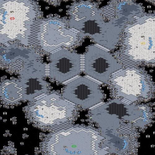
If you have a layout like this that is basically peripherically oriented (i.e. all bases/expos are more or less on the edges of the map) you can start by just placing the expos symmetrically around the periphery, like this:

or this:

The former is obviously much easier to tweak than the latter but in a real map you'll have to move at least some expos around a bit anyway (mains need more space, expos should not tank each other, some need more space, others less etc etc...)
After that you should be able to get a good picture of how you'd have to shape and tweak the terrain in between to guarantee functional symmetry, i.e. positional balance, for the expos.
If you want to think about it in more general terms, it's obvious that using a simple circle as base structure wastes a lot of space at the corners (about a quarter of overall map space alltoghether), and a triangle is far worse. A slightly deformed hexagon or cricle works very well, though.

regular hexagon
what you should aim for |
| LasTCursE | | |
| all of the ones you just stated are more fitable for a 4 player map |
| Freakling | | |
| Then you understand something wrong. The whole point is to fit a trinagular object as well as possible into a quadrangle... |
| JungleTerrain | | |
"Look at actek for example it's a good map but still has a huge ball of wasted space in the upper corner
Moonglaive also has wasted space in the corners
Even Tau Cross has wasted space too!"
Don't you ever use pro maps as the standard for good mapping, please.
Edit: "standard for *the best mapping possible*"
modified by JungleTerrain |
| Freakling | | |
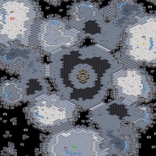
Aztec is a pretty good example for my first example, by the way.
Pick orange = mains, red = nats, green = minonlies and blue = thirds and you get Aztec (minus the additional gas expos around the center). |
| Nightmarjoo | | |
Too linear imo. Only one path out of the nat which then leads directly into the third, and then you get two paths from there, and that's it.
I was going to reccomend adding a third ramp/path to the highground expo from the area outside the nat, but then noticed that's impossible because your symmetry is so bad. Leave the (3)maps to testbug imo. |
| LasTCursE | | |
thank you for the nice words -.-
And the symetry isn't that bad the triangles are pretty normal and similar !!

modified by LasTCursE |
| Freakling | | |
equilateral triangle!
Google it! |
| LasTCursE | | |
| these are the same |
| Freakling | | |
OK. I forgot it's you I'm talking to... Let's start this .... basic...
google listen, think and before you answer.
Hint: Congruent != equilateral... |
| CrystalDrag | | |
| Started laughing at the red triangle. :D |
| LasTCursE | | |
Okay if you want to argue about the absolutely perfect symetry ever here is it measured
3rd


Nat


Main


Now before you feel so happy that you're so right look at the same measures on actek which you claim to be perfectly symetrical


i bet you can't even find a 3p map that will be exactly 60 degree in every single aspect
So tell me how if actek has same corners of the triangle my map would be unsymetrical but actek will be a model of symetry?
Protractor downloaded from the internet so it's as accurate as it gets :)
modified by LasTCursE |
| Freakling | | |
The salient point is that Aztec breaks symmetry to the good of space management... In your map it\'s to the worse...
And Aztec's nats are almost perfect.
modified by Freakling |
| LasTCursE | | |
| it also has huge balls of wasted space how is that better management? |
| JungleTerrain | | |
| You've got to be joking. |
| LasTCursE | | |
| I'm not joking it roughly has the same space as this map it's just used diferently (even not that different if you reverse the main+nat and put bridges instead of ramps |
| Freakling | | |
| Probably you shouldn't ask for our help if you're not going to accept it anyway. All the time you should use to improve the map you are just using to justify its shortcomings instead. |
| LasTCursE | | |
| why you talking about everyone i just don't agree that i have to move the whole left side down cuz it's not exactly 60 degree like you want it.. i did appriciate jungle's help for the map |
| neobowman | | |
| Symmetry aside, I think it would be better to extend the ramps for the fourth bases just a tad bit. |
| LasTCursE | | |
what you mean by extend
make middle ones normal size
make middle ones wider
make the ones towards third wider? |
| sTY_leZerg-eX | | |
| lol the symmetry pics !! ^^ |
| neobowman | | |
| The middle ones a bit wider. |
| LasTCursE | | |
| i'll update it when i'm not lazy :D |
| JungleTerrain | | |
Oh, btw, i've been using the same program stylezerg uses for his map pictures, which is Photoscape.
just google it. I started playing around with it, and you get clearer map pictures with good brightness/contrast adjusters so you can see more details. |
| LasTCursE | | |
yeah i know it, i think i even have it on my PC :) thx for answer
modified by LasTCursE |


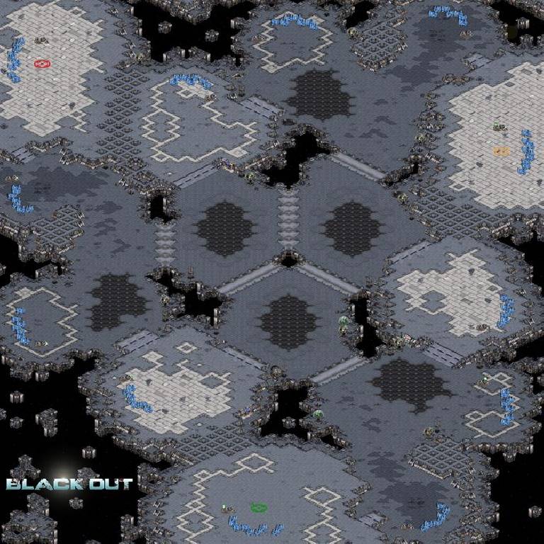
 (3)Blackout
 -
- Nore vs
  smtp(1on1, 1.16)
 Ivan(1on1, 1.16)